Introduction
Project Overview
LegalySpace is a SaaS platform specializing in document dematerialization and electronic signatures. The platform supports critical functions such as document exchange, communication campaign, time tracking, document validation, electronic signature…
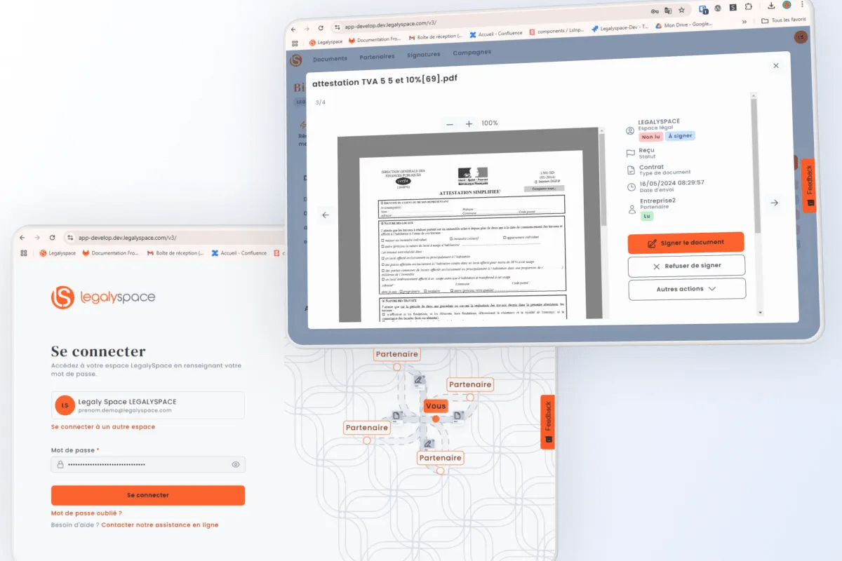
The redesign aimed to create a fully responsive user interface optimized for mobile devices, enhance accessibility, and integrate a scalable Design System built on Vue 3, Tailwind CSS, and Storybook.
Goals
- Improve usability in mobile: Simplify navigation and create a seamless experience across devices.
- Enhance accessibility: Ensure the platform meets WCAG 2.1 standards, focusing on color contrast, keyboard navigation and screen reader compatibility.
- Implement a Design System: Establish a reusable, consistent UI framework to streamline development and ensure scalability.
- Modernize the UI/UX: Refresh the visual identity and introduce mobile-friendly components for better engagement.
- Humanize our platform: Add illustrations and adapt our vocabulary to improve user-friendliness.
Scope of Redesign
Pages & features
The project encompassed the following key areas:
- Dashboard: A centralized hub displaying newsfeed, pending actions, and quick links.
- Onboarding: Guided flows for task completion.
- Document Exchange: Secure sharing, tracking, and management of files.
- Partner Listings: A dynamic directory of collaboration history with partners.
- Parapheur and Signature Module: Tools for document preparation, validation, and e-signature integration.
- Campaign Manager: An interface for creating and tracking communication campaigns.
- Time Tracking Module: A comprehensive tool for logging and managing work hours.


Tools & Technologies
- Design: Figma for prototyping, Tailwind CSS for utility-first styling.
- Documentation: Storybook for component management and collaboration.
- Development: Vue 3 for modern reactivity and scalability.
- Accessibility Testing: Lighthouse, Wave, and NVDA.
Process
This redesign involves technical modifications and evolutions that go beyond the visual design framework. The aim was not to change everything and give users a feeling of radical change, but to retain the main features of a version that was only 3 years old. Maintain continuity while adding a slight twist to respond to the various needs expressed to support and add a more human touch to the tool. Let’s take a look at the major reflections and steps taken to make the necessary adjustments to improve the user experience.
Analysis of Existing Pages and Information Architecture
The project began with an in-depth review of the existing SaaS platform. Through stakeholder interviews and usability testing, we identified inefficiencies in the navigation structure. For example, newly added modules (e.g., campaign manager, time-tracking) were only accessible from the dashboard without integration into the overall navigation. Users reported difficulties in finding key features, especially on mobile devices, because of inconsistencies in action prioritization.

Defining Page Templates and Core Components
To streamline development and enhance user experience, I categorized the platform into reusable page templates and defined essential components for each. This included:
- A dashboard template with modular widgets for customization.
- A task flow model for tasks completion efficiently.
- A detailed listing or table layout for partners and documents pages.
- A simple action model for simple actions like : fill a form, send a document…
- Specific modules for signature workflows and campaign management.
This modular approach ensured scalability and allowed for seamless feature additions.
Standardizing and Rationalizing Actions
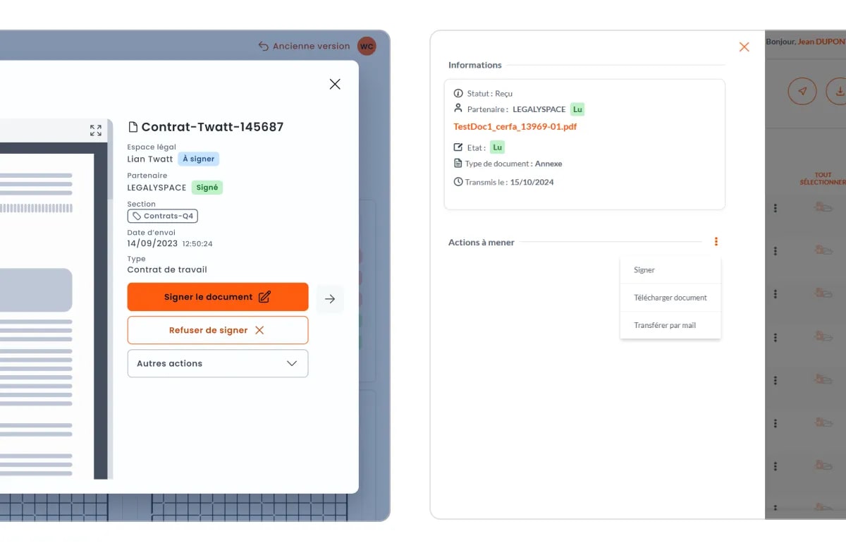
One critical focus was aligning primary and secondary actions across the platform to avoid user confusion. For example, actions like “Sign Document,” or “Upload File,” were made consistent in placement and hierarchy across all pages. With a clear definition of primary / secondary & danger CTA, this rationalization reduced decision fatigue and improved the clarity of the user journey.

Component Design Through a Design System
Using Vue 3, Tailwind CSS, and Storybook, we developed a robust design system tailored to the platform’s needs. Each component—buttons, forms, modals, and tables—was crafted with a focus on accessibility (WCAG 2.1 compliance) and responsiveness. The design system ensured that developers could easily reuse components, accelerating the implementation process while maintaining visual and functional consistency.
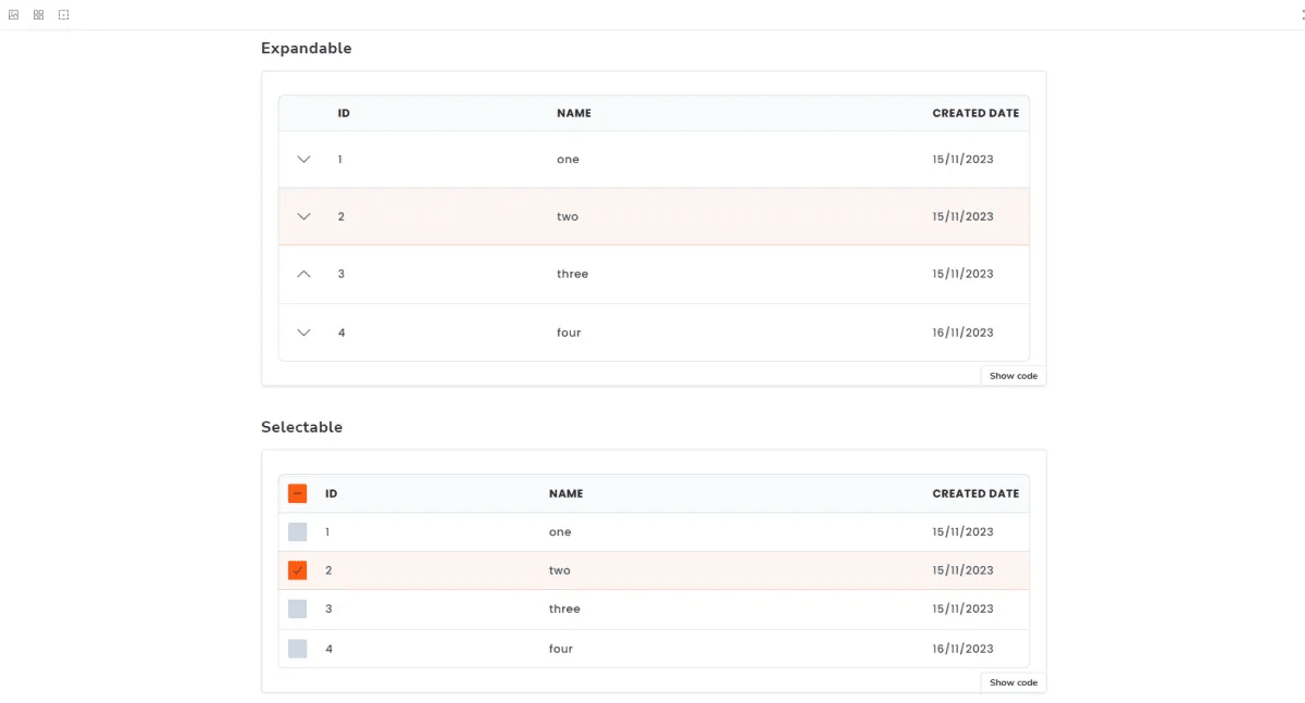
This approach was particularly crucial for major components in terms of functional scope. For example, the time taken to develop a robust table component was quickly offset by the speed with which list pages could be created. With, for example, the ability to make rows selectable or expandable as built-in properties, new developers or junior profiles can quickly become operational in the creation of new screens.

Creation of Writing Guidelines
To unify the platform’s tone and enhance comprehension, I developed writing guidelines that outlined best practices for labels, error messages, tooltips, and instructional text. The goal was to make the language simple, direct, and “no need to think”. For instance, technical jargon was replaced with user-friendly terminology and most common terms within other online tools were prioritized over more “in-house” terms to make the platform more approachable.

Integrating Illustrations for a Humanized Experience
Illustrations were introduced to make the platform feel modern and engaging. Custom visuals were added to key moments, such as the onboarding process, empty states (e.g., no documents uploaded), and success confirmations. These illustrations conveyed clarity and warmth, creating a more humanized digital experience.

Conclusion
The redesign of LegalySpace was a comprehensive effort to modernize and humanize the platform while addressing critical usability, accessibility, and scalability challenges. By introducing a modular approach to page templates and components, the platform now offers an intuitive and efficient user experience and has streamlined the development process, ensuring consistency and scalability for future updates. This redesign sets a strong foundation for LegalySpace’s continued growth and its ability to adapt to future challenges and opportunities.


Lessons Learned
My personnal key takeaways are :
Scalability Through Modular Design The adoption of a modular approach for page templates and components reinforced the value of scalability in both design and development. Defining reusable elements (like a robust table component for example) streamlined workflows and reduced development time, setting a standard for future updates.
The personality you put into your Design can be game changer Integrating custom illustrations and crafting writing guidelines transformed a traditionally functional tool into a more approachable and engaging platform. This highlighted how small, intentional design choices can significantly impact the perception of a brand or a tool.

