Context
As a Product Designer specializing in design systems, I recently led the creation of a design system at LegalySpace, a legal tech company. LegalySpace’s main front-end technology was Vue2 (VueJS). Unfortunately, the end of 2023 marked the official end of technical support for Vue 2, which will no longer be updated or receive security or browser compatibility patches. It was time to consider a migration to Vue3 and take advantage of the benefits offered by the latest version of the framework.
This project was a prime opportunity to improve the efficiency and consistency of our UI components and to align design and development processes, leveraging Vue 3, Tailwind CSS, and Storybook for effective documentation.
Defining the Goals
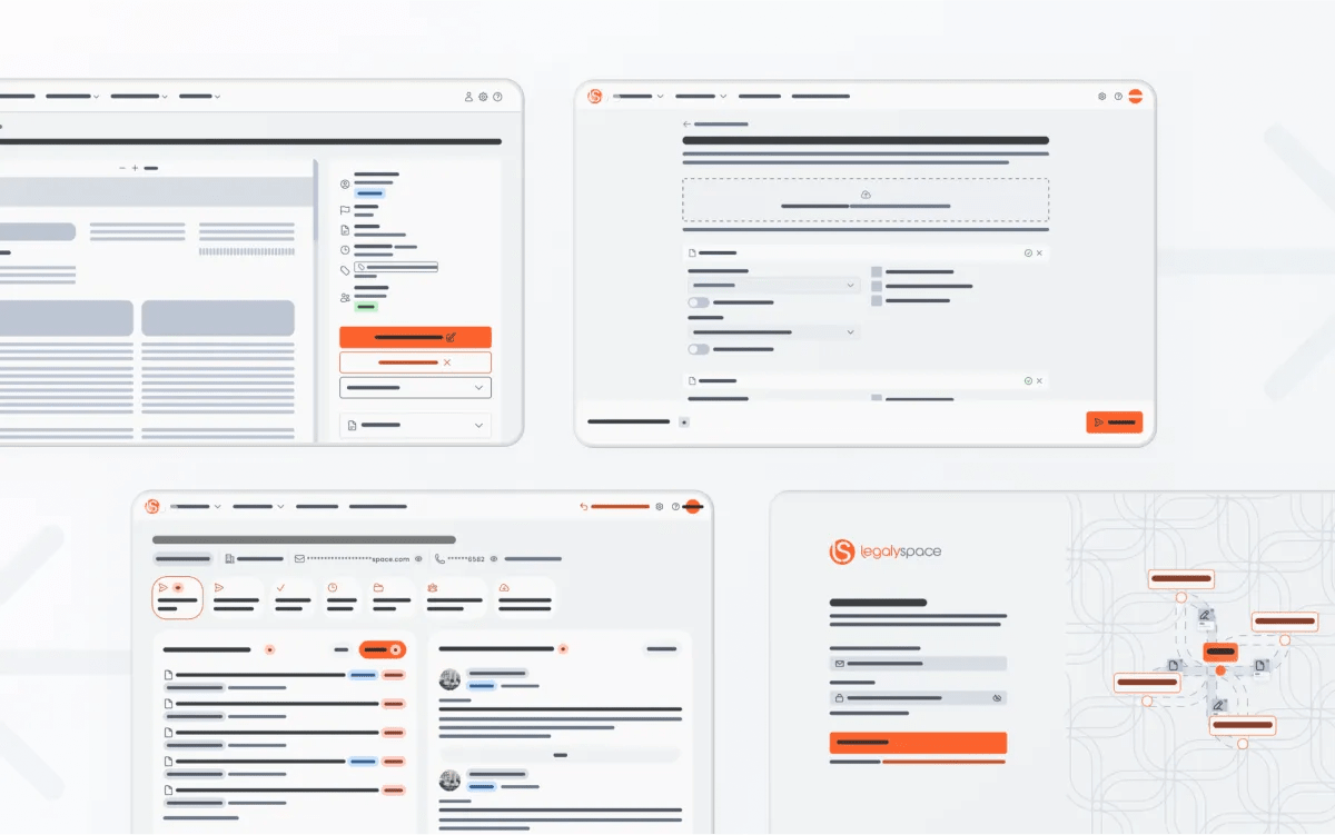
The need for a design system arose as LegalySpace scaled its product offerings, which resulted in a fragmented UI across different platforms. Our goal was to create a unified, reusable component library that could serve as the single source of truth for all design-related decisions, ensuring visual consistency across products.
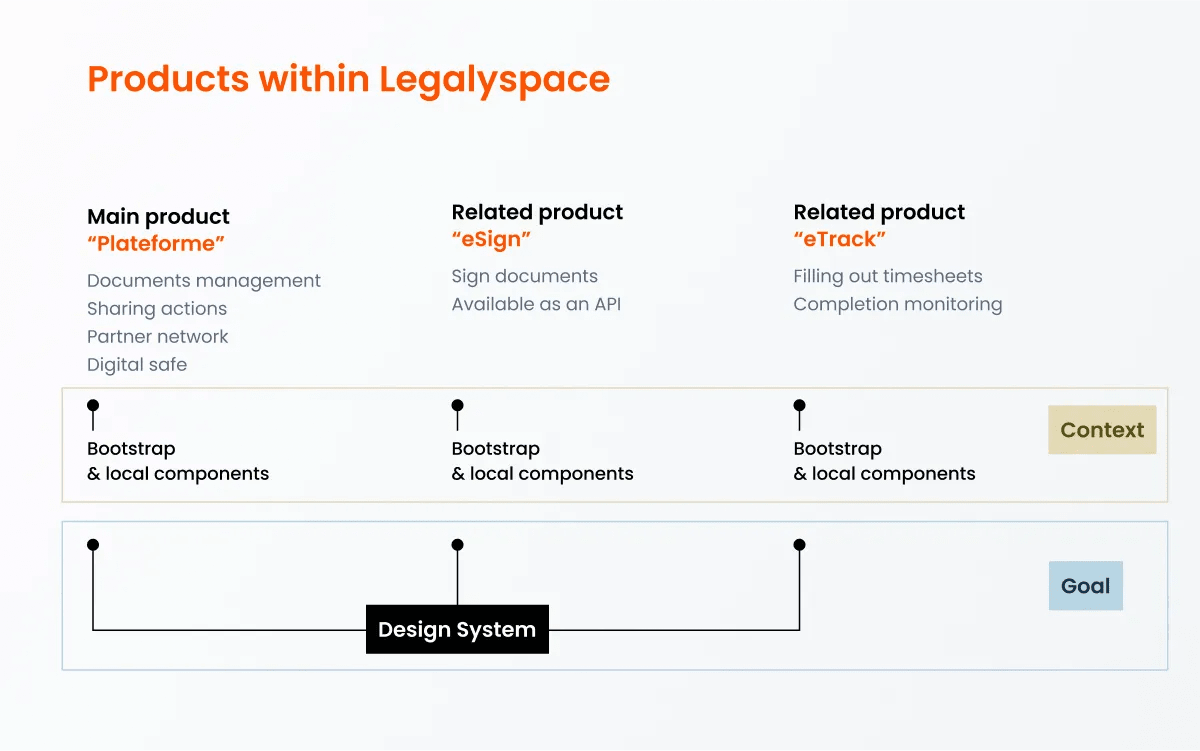
In collaboration with the front-end architect, we decided to build a system that was not only scalable but also designed with accessibility in mind, adhering to the principles of atomic design.
Collaborating with the Front-End Architect
Working closely with the front-end architect, we identified Vue 3 and Tailwind CSS as our primary technologies. Vue 3, with its modular structure, allowed for easy componentization, while Tailwind CSS provided a utility-first approach to styling, which perfectly suited our need for consistency and flexibility.
Throughout the project, the architect and I collaborated to define component standards that would bridge the gap between design and code. Using Figma, I created high-fidelity versions of every component required for our product interfaces.
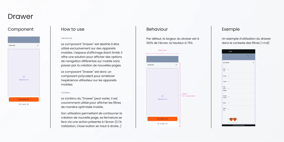
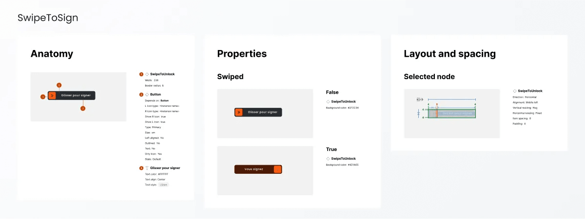
Each component in Figma was made up of different variants, properties & states. For each of them, I wrote a documentation in Figma with a prototype example to illustrate the states and some behaviour.
Once developed individually, components are documented by the development team within Storybook. Storybook documentation is perfectly aligned with Figma to avoid any misunderstandings. The real-time feedback loop and tests in isolation facilitated by Storybook allowed the team to catch issues early in the development process, ensuring a smoother handoff.
Accessibility as a Core Principle
Accessibility was a non-negotiable aspect of this design system. From the beginning, I set out to meet WCAG 2.1 standards, ensuring that our components were usable for all, including those with disabilities. This meant paying special attention to color contrast, keyboard navigation, and screen reader support.

We also chosen to prioritize the use of HTML-type components and avoid “home-made” whenever possible. This has several advantages in terms of accessibility: compatibility with assistive technologies, supported by all modern browsers and lighter to load.
Finally, using Storybook makes it easier to detect accessibility problems by isolating components from the business context. Storybook also provides access to unit tests and plugins specialized in accessibility auditing, such as the Storybook A11y Addon.
Atomic Design Approach
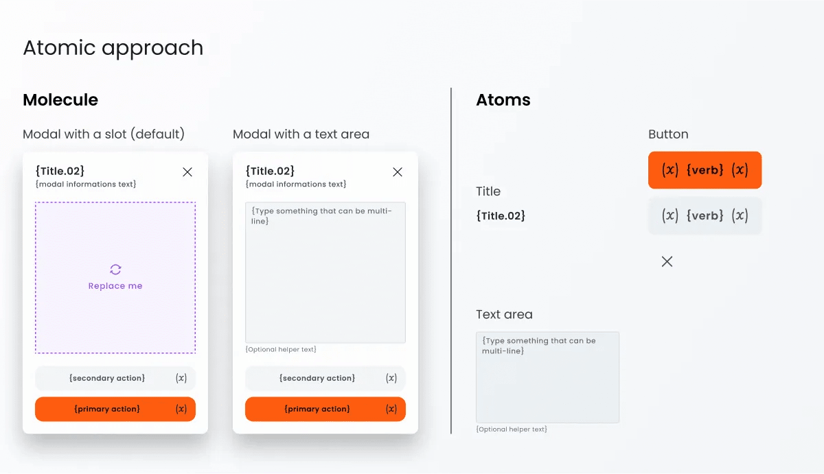
To ensure scalability and ease of maintenance, I adopted the “Atomic Design” methodology. This framework, popularized by Brad Frost, breaks down UI elements into their smallest parts, or “atoms,” which are then combined to form more complex structures, or “molecules” and “organisms.” This approach allowed us to build a system that was highly modular, making it easy to update components without affecting the overall architecture.
For example, we created atoms such as buttons, inputs, and icons. These were then combined into molecules like search bars and dropzone, which in turn formed organisms like complete forms or datatables. This modular approach not only made it easier to maintain the system but also ensured that the components were reusable across different parts of the application.
Documenting with Storybook
Storybook played a crucial role in documenting the design system. Each component was thoroughly documented with guidelines for usage, variations, and accessibility considerations. This documentation was invaluable for both the design and development teams, serving as a reference point for how each component should behave across different screen sizes and states.
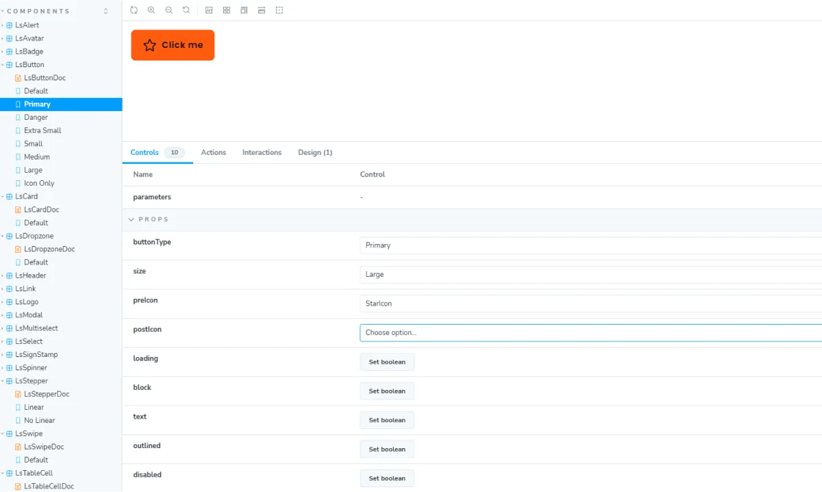
Additionally, Storybook’s ability to visualize components in isolation helped streamline the development process. Developers could interact with and test components independently before integrating them into the broader application. This separation of concerns minimized the risk of introducing bugs during implementation.
Lessons Learned
One of the key takeaways from this project was the importance of cross-functional collaboration. The tight feedback loop between designers and developers was instrumental in ensuring the success of the design system. Another lesson was the value of documentation. By using Storybook to document not just the visual aspects but also the behavior and accessibility requirements of each component, we were able to create a resource that could be used by teams across the company.
In conclusion, building a design system for LegalySpace using Vue 3, Tailwind CSS, and Storybook was a rewarding experience. The collaboration between design and development teams, combined with a strong focus on accessibility and the atomic design approach, resulted in a scalable, reusable system that will serve the company for years to come. If you’re interested in learning more about the tools and methodologies used in this project, I recommend checking out Storybook and Brad Frost’s Blog where you can find resources about Atomic Design.

